Sage green works beautifully on a table because it brings in color without making the setting feel heavy, and pairing it with deeper olive tones and soft ivory gives the palette much more dimension. Rather than covering every surface in green, start with light, neutral table linens to create breathing room, then introduce sage as the main color and burnt olive in smaller, richer layers for contrast. These sage green table setting ideas are designed around that balance, using soft fabrics, botanical details, candlelight, and restrained metallic accents to create a setting that feels fresh and polished while still warm enough for dinners, showers, weddings, and other special gatherings.
Why Sage, Olive & Ivory Work So Well Together
The appeal of this palette comes from the contrast between soft and deep tones. Sage brings a muted green that feels fresh and calming, while burnt olive adds a richer layer that keeps the setting from looking too pale or flat. A warm ivory base, similar to Cloud Dancer, helps separate the two greens and gives the table a lighter, more balanced appearance. Using a neutral tablecloth underneath also makes it easier to introduce color through overlays, napkins, chair accents, and smaller decorative details without making every surface compete for attention.
These shades also pair naturally with materials that already work well in event styling. Clear glassware, warm wood, subtle gold finishes, and soft greenery all complement sage and olive without changing the overall color story. The key is to let ivory remain the breathing space, use sage as the dominant green, and reserve olive for contrast so each shade stays distinct instead of blending into one uniform block of color.
Sage Green Table Setting Ideas With Olive & Ivory Accents
Once the palette is established, the table comes together by deciding where each shade should appear. Keep the larger surfaces light, allow sage to carry most of the color, and introduce olive in smaller layers for contrast. From linens and chair styling to candles and place settings, repeating the three tones in different proportions will help the setup feel coordinated without making everything look overly matched.
Start With a Soft Ivory Base

Begin with Cloud Dancer-inspired ivory, cream, or warm white as the lightest layer of the setting. Neutral tableware can continue that softness across each place setting while leaving plenty of room for sage and olive fabrics to stand out. Keeping the foundation simple is especially important when working with several shades of green, since the ivory creates visual separation and prevents the finished table from feeling too dark or overly monochromatic.
Use Sage Green as the Main Table Color

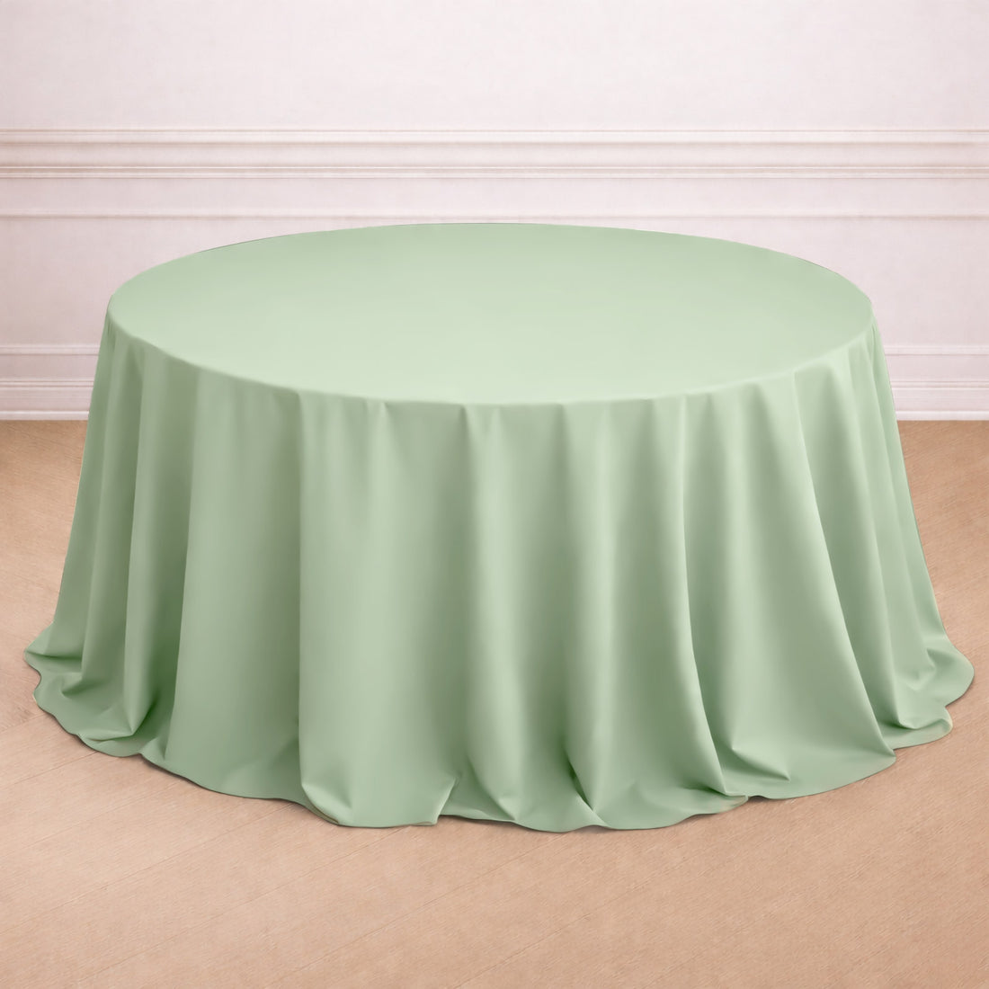
Let sage carry most of the color by introducing it through one of the larger fabric layers, such as a round tablecloth. Because sage is muted rather than bright, it can cover a larger area without making the table feel too saturated. Pair it with ivory dinnerware and lighter surrounding details so the green still feels soft and balanced, then save the darker olive tones for smaller layers that will add contrast later.
Layer Burnt Olive for Deeper Contrast

Once sage establishes the softer green layer, introduce burnt olive in smaller amounts to create more depth. A contrasting table overlay works especially well because it allows the lighter sage or ivory underneath to remain visible while adding a richer tone across the table. Keep the olive layer intentional rather than covering every surface with it. The difference between the muted sage and deeper olive is what gives the palette dimension and keeps the overall setting from looking flat.
Repeat Sage Through the Chair Styling

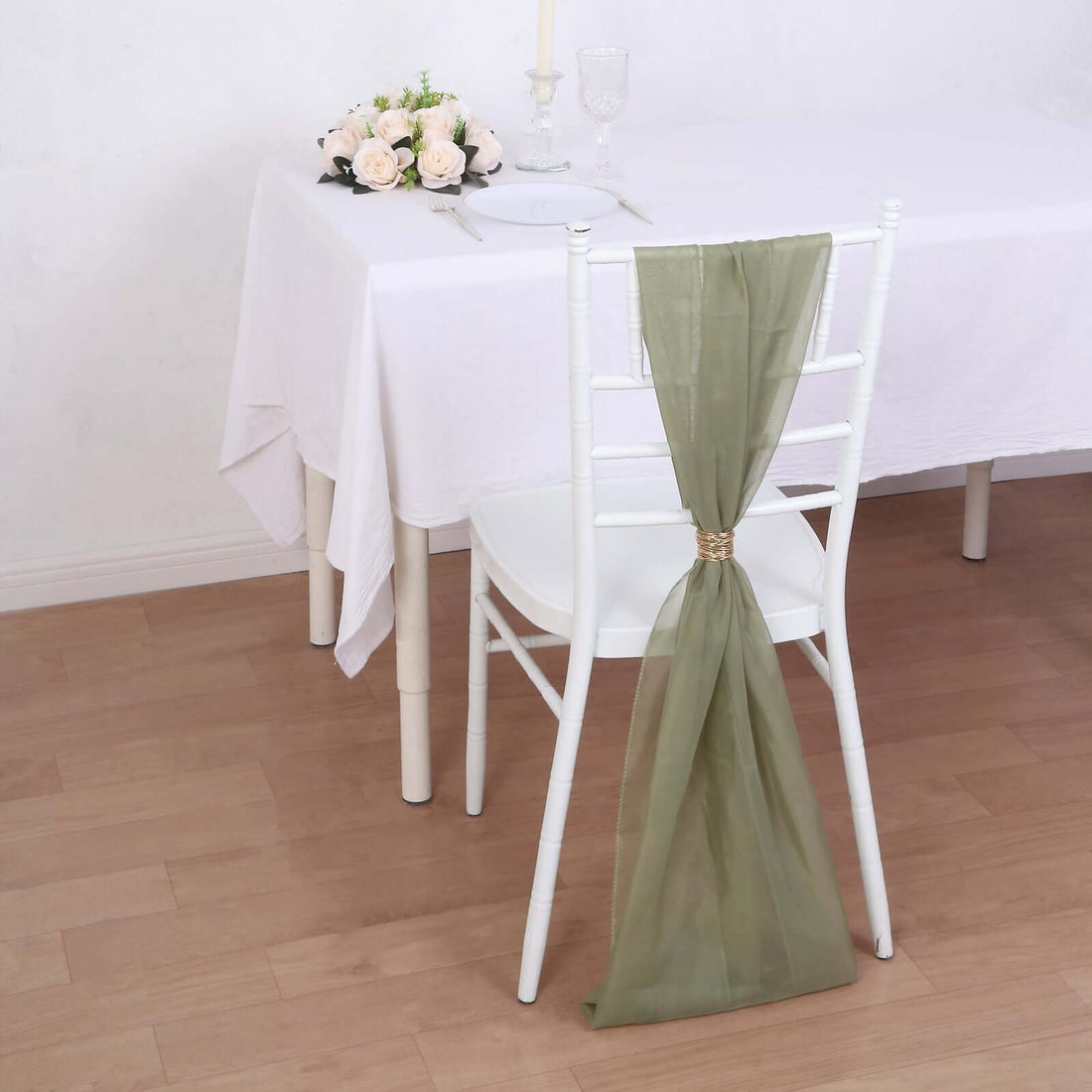
Carry the color beyond the tabletop by adding soft sage chair sashes around the seating. Chiffon works particularly well with this palette because its sheer, flowing texture keeps the green feeling light even when it is repeated around the entire table. Instead of creating tight formal bows, let the fabric drape naturally or fall in loose knots so the chair styling complements the softness of the table rather than competing with it.
Build a Green and Ivory Place Setting

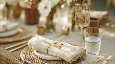
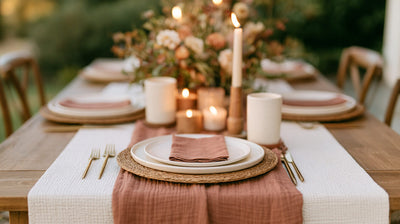
At each seat, bring the palette together in smaller layers. Start with ivory dinnerware, add a sage or neutral cloth napkin, and use charger plates and placemats to introduce texture or a subtle contrasting finish beneath the plates. You do not need every component to be green. Repeating sage in one element while allowing ivory to dominate the place setting creates a cleaner look and gives the deeper olive details elsewhere on the table more impact.
Add Candlelight in a Deeper Green

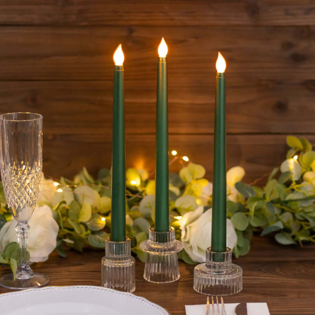
A darker green accent can make the softer sage palette feel more layered, especially when it appears in a small decorative element. Hunter emerald decorative candles can add that deeper note without changing the overall color direction, while simple candle holders keep the focus on the candle color itself. Space them through the center of the table rather than grouping too many together so the emerald reads as an accent instead of becoming another dominant shade.
Keep the Centerpiece Soft and Botanical

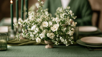
Choose florals that lighten the green palette rather than adding another dense block of color. Cream and white artificial flowers can soften the center of the table, while delicate greenery and faux foliage connect naturally with the sage and olive textiles. Keep the arrangement low and slightly loose, leaving some open space between stems and smaller clusters so the layered linens and candle details remain visible.
Add Small Gold Details for Warmth

A few warm metallic accents can keep sage and olive from feeling too cool. Add gold through flatware, decorative edging, or understated napkin rings rather than introducing large metallic pieces across the table. Against ivory and muted greens, even a small amount of gold catches the light and gives the setting a more polished finish while allowing the three-color palette to stay firmly in focus.
Sage Green Table Decor to Complete the Look
A few well-chosen pieces are enough to carry the sage, olive, and ivory palette across the entire setting. Use a sage green tablecloth as the main color foundation, then layer a burnt olive overlay to introduce deeper contrast without hiding the softer green underneath. Dusty sage chiffon chair sashes can repeat the palette beyond the tabletop, while hunter emerald LED taper candles add a darker green accent that becomes especially striking once the table is lit for the evening.
Together, these pieces create variation within the green palette without making every element look identical. Keep ivory and warm white details around them to break up the color and give each shade enough room to stand out.

Bring the Green Palette Together
The key to making sage, olive, and ivory work together is giving each shade a clear role. Let ivory keep the setting light, use sage as the main color, and bring in burnt olive or deeper green only where you want more contrast. A few warm gold details, soft botanical elements, and candlelight can finish the look without adding too much visual weight. When the colors are repeated in small, intentional ways across the table, chairs, and place settings, the result feels cohesive, fresh, and polished without looking overly coordinated.