Choosing wedding colors sounds easy until you are faced with endless inspiration online and too many opinions from every direction. Learning how to choose wedding colors is less about chasing trends and more about making intentional choices that work together across your venue, decor, and overall style. The right wedding color palette should feel cohesive, photograph well, and translate seamlessly from ceremony backdrops to table linens and reception details. This guide breaks down how to choose wedding colors step by step, helping you move past inspiration overload and confidently create a palette that looks polished, timeless, and intentional in real life, not just on a screen.
Start With the Wedding Setting and Venue Style
Your wedding venue plays a major role in how your colors will look, so it should be the starting point when deciding on a wedding color palette. Indoor and outdoor venues interact with color differently, especially when lighting and materials come into play.

When evaluating your venue, consider the following:
- Indoor vs outdoor setting, since natural light softens colors while indoor lighting can intensify or mute certain shades
- Existing venue colors, such as wall tones, flooring, wood, or stone elements
- Permanent materials and finishes, including metal accents, drapery, or carpeting that cannot be changed
Choosing wedding colors that work with your venue, rather than against it, helps create a cohesive look across your ceremony and reception. When your palette complements the space, your decor, linens, and floral details feel intentional instead of visually competing with the surroundings.
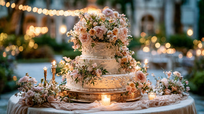
Choose Wedding Colors Based on the Season
Seasonality plays a big role in how wedding colors feel and photograph. While you can use almost any palette year-round, certain colors naturally align better with the mood, lighting, and textures of each season. Using seasonal cues helps your wedding color palette feel balanced and appropriate without feeling overly themed.
Common wedding color directions by season include:
- Spring weddings, soft pastels, light neutrals, and fresh floral tones that feel airy and romantic
- Summer weddings, brighter colors, tropical shades, and high-contrast combinations that stand out in strong natural light
- Fall weddings, warm earth tones, muted jewel shades, and richer colors that complement autumn textures
- Winter weddings, deep neutrals, monochromatic palettes, and metallic accents that add depth and elegance
Choosing wedding colors with the season in mind helps your decor, florals, and linens look intentional and cohesive, while also ensuring your palette feels natural in photos and lighting conditions throughout the day.
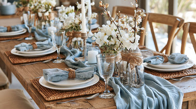
Match Wedding Colors to Your Personal Style

Your wedding colors should reflect your personal style, not just current trends. A palette that aligns with your aesthetic helps the entire celebration feel cohesive and intentional, from the ceremony to the reception. Classic styles often pair well with soft neutrals and timeless combinations, while modern weddings tend to favor limited or monochromatic palettes. Romantic, rustic, or boho celebrations usually feel more natural with warm, muted tones and organic shades. Choosing wedding colors that match your personal style ensures your decor looks consistent, polished, and authentic throughout the day.
Consider How Wedding Colors Translate Across Decor Elements
Wedding colors should not just look good on a palette, they need to translate well across real decor pieces throughout your event. Because color can appear differently depending on fabric, texture, and lighting, it is important to think beyond swatches and inspiration photos when finalizing your wedding color palette. Large decor elements play the biggest role in defining the space, especially table linens, chair covers, and backdrops, which create the visual foundation for both the ceremony and reception.
Start with your foundation pieces, these large decor elements set the tone for your entire wedding color palette:


Once your foundation decor is in place, accent colors can be layered in through smaller details like tableware, centerpieces, or signage to add depth without overwhelming the space. Metallic finishes can also act as visual neutrals, helping tie multiple tones together and elevate the overall look from ceremony to reception.
Avoid These Common Wedding Color Mistakes
Even well-chosen wedding colors can fall flat if they are not applied thoughtfully. Some of the most common issues come from how colors are tested, combined, and used across decor elements.

Common wedding color mistakes to avoid include:
- Choosing colors based only on online inspiration without testing them in real lighting
- Not accounting for how colors appear on large decor pieces like linens, backdrops, or draping
- Using too many colors at once, which can make the overall look feel busy instead of cohesive
- Mixing warm and cool tones without a clear plan, especially when metallics are involved
- Relying on subtle shades that get washed out under strong lighting
Avoiding these mistakes helps ensure your wedding color palette looks polished, balanced, and consistent from the ceremony to the reception.
How to Finalize Your Wedding Color Palette With Confidence
Once you have narrowed down your wedding colors, the final step is making sure they work together in real settings. Testing your palette before committing helps prevent last-minute changes and visual inconsistencies. Seeing colors applied to actual fabrics, table setups, or small decor samples gives you a clearer idea of how everything will look on the day itself.
Locking in your wedding color palette early also makes planning easier across all vendors and decor decisions. When your colors are consistent from the start, your linens, florals, stationery, and reception details naturally align, resulting in a cohesive and polished look. Finalizing your palette with confidence allows you to move forward with the rest of your wedding planning knowing your overall design is intentional and well thought out.