Color plays a crucial role in setting the mood of any event. The right color combination can create a memorable and visually stunning atmosphere, while the wrong one can make the décor feel mismatched. Whether you're planning a wedding, corporate event, birthday party, or seasonal gathering, choosing colors that look good together is essential. From classic to contemporary, good color combos can transform any venue into an enchanting setting.
In this guide, we'll explore what are the best color combinations for different event themes, how to style them effectively, and common mistakes to avoid. Whether you prefer a bright color palette or a more elegant and subdued look, we've got plenty of color scheme ideas to inspire you.

The Psychology of Colors in Event Decoration
Understanding color psychology is key to selecting a good color combination that enhances the event's ambiance. Each color evokes different emotions, making it essential to match the right shades to the event's purpose.
How Colors Influence Emotions and Event Atmosphere
🔵 Blue - Calm & Trustworthy
Blue evokes feelings of serenity, trust, and professionalism. It's commonly used in corporate events, weddings, and formal gatherings. Lighter blues create a soothing ambiance, while deeper shades like navy exude sophistication.

🔴 Red - Passion & Energy
Red symbolizes excitement, passion, and power. It's perfect for bold and high-energy events, such as galas, festive celebrations, and themed parties. However, using too much red can feel overwhelming, so it's best balanced with neutrals.

🟡 Yellow - Joy & Optimism
Yellow is associated with happiness and positivity, making it ideal for birthday parties, summer gatherings, and casual celebrations. It works beautifully in a bright color palette but should be used in moderation to avoid overstimulation.

🟢 Green - Nature & Harmony
Green brings a sense of balance, growth, and tranquility. It's a great choice for eco-friendly events, outdoor weddings, and garden parties. Sage green, olive, and emerald are especially popular in modern color palette ideas.

🟣 Purple - Luxury & Creativity
Purple conveys royalty, luxury, and creativity. It is often used for upscale weddings, artistic events, and evening receptions. Lighter shades like lavender create a soft, romantic vibe, while deep purples add drama and opulence.

⚫ Black - Elegance & Sophistication
Black represents sophistication and power, making it a go-to choice for black-tie events, modern weddings, and corporate gatherings. Pairing it with metallics like gold or silver enhances its luxurious feel.

⚪ White - Purity & Simplicity
White symbolizes elegance, simplicity, and purity. It is a classic choice for weddings and formal events, often used as a primary color to create a fresh and timeless look.

💗 Pink - Romance & Playfulness
Pink adds a soft and romantic touch, making it a favorite for weddings, baby showers, and feminine-themed parties. Blush pink, paired with gold or ivory, creates an elegant and charming aesthetic.

🟠 Orange - Warmth & Enthusiasm
Orange radiates warmth and excitement, making it a vibrant choice for fall events, tropical themes, and playful celebrations. When paired with softer tones, it brings energy without being too overpowering.

🔘 Gray - Modern & Neutral
Gray is a versatile neutral that adds sophistication to any event. It pairs well with almost any color and is perfect for modern and minimalist themes.

Choosing Colors Based on Event Type & Theme
The right color combination should align with the event's purpose:
- Formal Events - Stick to classic and elegant shades like black, white, navy, and gold.
- Casual or Festive Events - Incorporate vibrant and playful hues like yellow, orange, and aqua.
- Romantic Occasions - Soft pastels, blush tones, and deep reds enhance the intimate setting.
- Corporate Gatherings - Professional color schemes like blue, gray, and silver work best.
Consider Venue & Lighting
Colors may look different under various lighting conditions. Natural light enhances pastels, while artificial lighting can intensify bold shades. Experimenting with good color combos that complement the venue’s existing décor is essential for a seamless look.

Current Color Trends - What's Trending in 2025?
As event decor evolves, popular color combinations for 2025 reflect a mix of timeless elegance and modern vibrancy. Here's what's trending this year:
Weddings
- Sage Green & Champagne - A soft, earthy palette with a touch of sophistication.
- Terracotta & Blush - Warm, romantic tones for boho and rustic themes.
- Navy & Gold - A luxurious yet classic combo for evening weddings.
Corporate Events
- Charcoal Gray & Emerald Green - A sleek, professional look with a natural touch.
- Black & Copper - Modern and bold, ideal for upscale corporate gatherings.
- Deep Blue & Silver - Cool and calming tones for formal settings.
Parties & Celebrations
- Peach & Lilac - A fresh and playful mix for birthdays and springtime events.
- Neon Accents with Neutral Bases - A mix of minimalism and bold pops of color.
- Teal & Coral - Vibrant tropical hues perfect for summer parties.
Stunning Color Combinations for Different Event Themes
Every event has a unique theme, and choosing the right color palette ideas ensures a cohesive and stylish look. Whether it's a wedding, corporate function, or birthday celebration, selecting themes for party events that align with the perfect color scheme can transform any space into a stunning setting. Below are some inspiring combinations for different occasions.
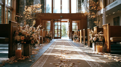
Wedding Color Combinations
For weddings, elegance and romance take center stage. Here are some of the best color combinations for a dreamy wedding setup:
- Classic Romance → White & Gold
A timeless combination that exudes sophistication. Use table runners for weddings in gold accents to elevate the tablescape, and complement the look with delicate white floral arrangements.

- Bohemian Chic → Terracotta & Sage Green
This earthy duo is perfect for outdoor and rustic weddings. Incorporate silk flowers and greenery to enhance the natural aesthetic, and use wooden décor elements for a warm, organic feel.

- Elegant Minimalism → Black & Ivory
A sleek, contemporary look that radiates sophistication. Opt for black chargers and ivory linens to create a dramatic yet refined contrast. Simple candlelit centerpieces complete the look.

- Dreamy Pastels → Lavender & Blush Pink
A soft, romantic palette ideal for spring weddings. Pair blush pink florals with lavender-hued linens, and add twinkling fairy lights to enhance the ethereal atmosphere.

Corporate Event Color Palettes
Corporate events demand a refined and professional color scheme. Here are some stylish combinations:
- Professional & Sleek → Navy Blue & Silver
This combination conveys trust and authority. Use navy tablecloth options to set an elegant foundation, and complement with silver accents such as metallic charger plates or crystal glassware.

- Modern Luxury → Black & Gold
A bold, upscale choice for galas and high-end corporate functions. Enhance the ambiance with black velvet drapes and gold-accented décor, such as candle holders and place settings.

- Eco-Friendly Theme → Earthy Green & Beige
A natural palette that promotes sustainability. Incorporate wooden furniture, linen napkins, and potted greenery to create a fresh, eco-conscious atmosphere.

Birthday Party Color Schemes
Whether it's a fun kids' party or a stylish adult celebration, the right colors make a statement.
- Vibrant & Playful → Yellow & Aqua
A bright, energetic palette perfect for kids' birthdays or summer parties. Decorate with balloon garlands, aqua-blue banners, and cheerful yellow tableware.

- Sophisticated Celebration → Burgundy & Rose Gold
A rich and luxurious combination for milestone birthdays. Set the stage with shimmering rose gold accents and deep burgundy florals. Use decorative centerpieces to add a touch of elegance.

- Themed Birthdays → Pastel Rainbow for Kids, Emerald Green for Adults
Pastel Rainbow: A whimsical theme with soft pinks, blues, and lilacs, perfect for a child's birthday. Opt for pastel balloons, confetti, and fun party favors.

Emerald Green: A sophisticated choice for adults. Pair with gold décor, dark green candles, and chic drinkware for an elegant touch.

Seasonal & Holiday Events
Seasonal parties allow for creative color scheme ideas that match the time of year.
- Spring Soirees → Peach & Lavender
Light, refreshing colors for garden parties and bridal showers. Enhance the setting with fresh floral centerpieces and flowing fabric drapes in soft hues.

- Summer Parties → Coral & Teal
A tropical-inspired combination bursting with energy. Use backdrop stands to create an eye-catching photo area with vibrant tropical leaves and floral accents.

- Autumn Gatherings → Mustard & Burgundy
A cozy, warm palette that perfectly captures fall's essence. Set up rustic wooden tables with mustard-colored napkins and deep burgundy florals for a chic autumn vibe.

- Winter Elegance → Silver & Navy
A sophisticated winter palette perfect for holiday galas and New Year's Eve parties. Add shimmering silver details through table settings and twinkle lights, while navy velvet fabrics enhance the luxurious feel.

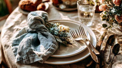
How to Perfectly Match Colors for Event Styling
Creating a visually stunning event requires more than just choosing beautiful colors-it's about balance, contrast, and lighting. By following key design principles, you can ensure a well-coordinated and aesthetically pleasing event setup.
-
1. Use the 60-30-10 Rule for balance
One of the best ways to create a harmonious color combination is by following the 60-30-10 rule, a classic design principle used in interior design and event styling.

Primary Color (60%) → The dominant color in the décor. This includes large elements like tablecloths, drapes, or walls.
Secondary Color (30%) → A complementary shade that enhances the primary color. This can be seen in floral arrangements, furniture accents, or statement pieces.
Accent Color (10%) → A contrasting hue that adds interest and depth. Accent colors are best used in napkins, centerpieces, candles, or signage to complete the look.
-
2. Texture & Contrast for Depth
A visually appealing event isn't just about colors-it's also about texture. Mixing different textures adds dimension and makes the décor more engaging.
Mix Matte and Glossy Elements - For a luxurious event, combine matte table linens with shiny metallic accents like gold-rimmed glasses or crystal chandeliers.
Combine Bold and Neutral Shades - If using a bright color palette, balance it with neutral shades like white, beige, or gray to avoid overwhelming the space. For example, a coral and teal summer party theme looks stunning when paired with white furniture.
-
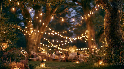
3. Lighting Consideration: Setting the Right Mood
Lighting plays a crucial role in how colors appear in an event setting. The same color scheme can look vastly different under various lighting conditions.
Soft Lighting Enhances Pastels and Neutrals - Warm-toned fairy lights, candlelight, or soft uplighting create a dreamy ambiance, perfect for weddings and romantic events featuring blush, lavender, or ivory.
Bright Lighting Makes Bold Colors Pop - If you're using vibrant shades like red, royal blue, or emerald green, opt for LED or spotlights to enhance their intensity. This works well for corporate events and gala dinners.
Avoiding Common Color Mistakes in Event Design
While selecting a color combo is exciting, making the wrong choices can lead to an uncoordinated or overwhelming event design. To ensure a cohesive and visually appealing setup, avoid these common color mistakes:
1. Using Too Many Colors - Stick to 2-3 Main Shades
A major design mistake is incorporating too many colors, which can make the event look chaotic and unorganized. Instead, follow this simple rule:
✔️ Choose a dominant color (Primary - 60%) - This should be the foundation of your décor, such as tablecloths or draping.
✔️ Pick a complementary color (Secondary - 30%) - This helps create contrast and balance, seen in floral arrangements, furniture, or signage.
✔️ Use an accent color (10%) - This adds a pop of interest through napkins, decorative accessories, or candles.
For example, instead of mixing five different colors, a romantic wedding could feature blush pink and ivory as primary shades with gold accents for elegance.
2. Ignoring Venue Colors - Factor in Walls, Flooring, and Furniture
Not considering the existing colors of the venue is a frequent oversight. Even the most perfect color combos can clash with the venue's carpet, curtains, or wall paint.
💡 Pro Tip: Before finalizing your color scheme, visit the venue and take note of the dominant tones in flooring, walls, and permanent fixtures. If the venue has dark wooden floors, a moody color palette (navy, emerald, and gold) will complement it better than pastels.
3. Overuse of Neon or High-Contrast Colors - Use Bold Shades Sparingly
Bright colors can add energy and vibrancy to an event, but too much neon or intense contrast can feel overwhelming and unbalanced.
🚫 Mistake: A neon pink and electric blue combination across all décor elements.
✅ Fix: Use neon as an accent rather than the main color. For example, in a modern party, neutral tones (black, white, or gray) can be the base, with neon pink accents in centerpieces or signage.
The key is balance-bold colors should enhance, not overpower, the event ambiance.
The right color combination can elevate any event's atmosphere and leave a lasting impression on guests. Whether you prefer classic, trendy, or bold color scheme, planning your event's palette thoughtfully ensures a stunning aesthetic.
Get inspired and start experimenting with your favorite color combos that suit your event's theme! Transform your next event with a beautifully curated color palette that wows your guests.